The Inspiration for my First Typeface
I have been wanting to design a typeface since I was little. I was that kid who dreamt about letterforms. Yes, that was me! I am grateful for the influence of Sesame Street and the School House Rock videos. They utilized a visual approach to letters and words set to music that I still remember. But for me, it was deeper than these shows. This details some of my fascination with letters:
- I grew up in the 1970s when penmanship was a point of pride. Writing elegant cursive letters earned me the praise of all of my elementary school teachers. I was an excellent writer at an early age even though I attended a low performing elementary school.
- In 2nd grade, I studied my mom’s cursive handwriting. It came in handy when I needed to forge her signature on a few school forms. (This was the era when schools did not call home. They expected a form to reach the parent when it was, you guessed it, sent home with the child.)
- As an 8 year old growing up in North Philly, I would grab red moist broken brick from the alley and draw big graffiti letters on the street. This was before sidewalk chalk was invented. LOL
- As a pre-teen, I studied the print handwriting of adults. My mom’s friend had an intriguing writing style. I secretly obtained a writing sample from his bag and I replicated it. I practiced so much that it replaced my own style of handwriting.
- As a teen, I loved looking at album covers. My mom had a collection from the 70s and 80s when the emphasis was on artwork and creative expressions of type. I especially liked the Parliament Funkadelic logotype the most.
- I attended a vocational high school in my neighborhood where I learned how to write calligraphy. Once the personal computer became the standard in the 1990s, I abandoned this craft. Lately because of Instagram, I have circled back around to it.
- As a graphic designer in my 20s, I enjoyed riding the subways in big cities to examine how type and design were used to direct people.
- In my 30s, I left the design field for 7 years to become a youthworker in a disadvantaged African American community in Delaware. As the character development component of an afterschool program, I taught elementary school kids how to create their own typeface. They used it to pass messages to each other throughout the school day thoroughly confusing their teachers. Eventually, they found out and thanked me for getting their students excited about the written word.
But art school almost killed this passion of mine.
When I entered the graphic design department as a sophomore at the University of the Arts, I learned how technical and cerebral the study of graphic design can be. I heard a lot about Swiss typeface designers Adrian Frutiger, Max Miedinger and Emil Ruder. I remember how super boring it was when internationally known typeface designer Wolfgang Weingart did a weeklong workshop on kerning type! Little did I know I would use much of this technical and experiential knowledge during my professional career.
As a creative person, I trust my intuitions and observations. I spend time observing people, places and things to see what others do not see. I learned this from my mom, my old neighborhood and my professors. When I began to recently think about designing a typeface, I reasoned that the best ones have already been created: Helvetica, Universe, etc. I went back and forth between a classical look and a trendy look. Eventually, I let my mind wander and the thoughts that came to mind were North Philly and bridges.
North Philadelphia
 For some, North Philly represents blight. I always knew this because I saw how people responded when I told them where I was from. As a young adult, I traveled to three East African countries in 1994. While in Kenya, I mentioned my neighborhood and they looked at me with pity in their eyes. That is when I realized that North Philly had a international reputation…and it was negative. Although North Philly worsened during the Crack epidemic in the 1980s, I was also there when the times were not so bad. When I look back, I see a fragile community that was resilient, strong and proud. I knew African American businesses, married couples, single parents and retired people who made sure kids like me felt valued. In my adult years, I learned about my neighborhood’s history as a manufacturing hub in the 19th and 20th century. (Many of the big box warehouses are condos and lofts now.) Back then, West Diamond St. (where I grew up) was known as a place for wealthy industrialists. In the 1940s and 1950s, it became a destination for southern Blacks and eventually became a center of Black culture in Philly. Various domestic and international crisis during the 20th century impacted the neighborhood such as The Great Depression, manufacturing outsourcing in the 1960s, etc.
Bridges in North Philly
As a kid, I remember seeing bridges everywhere in North Philly. Most were railroad overpasses with a truss-style design. But the larger truss bridges fascinated me.
- There was a truss bridge at 17th Street north of Cambria that I especially liked. The SEPTA bus I traveled on with my mom would cross it. The bridge is still there but the visible truss beams were dismantled a while ago.
- Although the Elevated train (the El) did not go through my neighborhood, I marveled at its truss structure when I used it to travel to and fro middle school in Kensington.
- Everyday when I went home after high school track practice, I crossed a truss bridge near 18th and Glenwood Avenue. ( I just found out it is called Margie St. Bridge.)
- My ultimate favorite was the Strawberry Mansion Bridge in Fairmount Park linking North Philly and West Philly over the Schuylkill River. I would ride my bike to the bridge and stop on it feeling its movement as it swayed.
When I started Dobbins Vo-Tech High School, I chose architecture as my second shop choice because of my love for bridges. (My first choice was commercial art which is what I eventually got.) While in college at the University of the Arts, I spent occasional time in the architecture dept. I appreciated their aesthetic approach but the problem was that my 3-D skills sucked. CAD (Computer Aided Design) was still very new. Even though the math completely scared me away, I saw the connection between graphic design and the built environment.
I saw more truss bridges when I began to travel throughout the city (including to New Jersey):
- The Betsy Ross Bridge
- Tacony Palmyra Bridge
- Falls Bridge (Fairmount Park)
- George C. Platt Bridge (Southwest Philly)
- 42nd St. Bridge (West Philly)
- Girard Point Bridge (Southwest Philly)
- Old York Road Bridge (Hunting Park)
Bridges represent a combination of ingenious engineering, architecture and aesthetics. They symbolize strength, structure, steadfastness, boldness and resilience. I especially like truss bridges because they attempt to strike a balance between visual aesthetics and engineering.
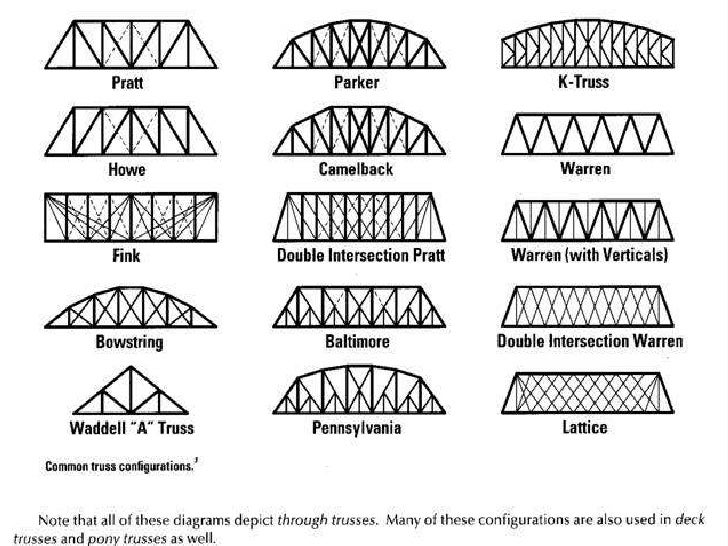
My Truss Me font was inspired by my love of my native North Philadelphia and truss bridges. At some point, I will make this an official font and place it on the internet.
This commentary was brought to you by the Letter T.;)

Update (7/11/17):
Six months ago, an article was written about an advertising agency that created fonts to represent the different neighborhoods in Philly. While the other neighborhood fonts drew from past and present positive characteristics, the North Philly font was made of wooden boards said to resemble the rough and blighted parts. A few protested and it was taken down.
I recently sent an email to a few media outlets that published the original story informing them that I created a font that symbolizes North Philly, my old neighborhood, Here is one of the articles. Pass it on.