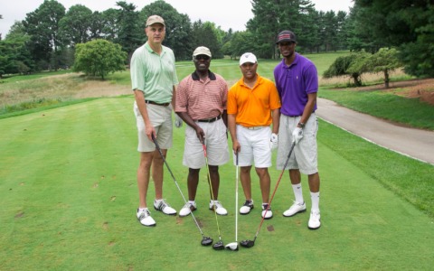
Case Study: Advocacy Organization Rebranding Project
Case Study: Advocacy Organization Rebranding Project
Strategy: Rebrand to improve image and expand their reach.
LSU guidelines2
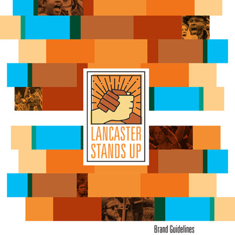
LSU guidelines3
LSU guidelines4
LSU guidelines6
LSU guidelines10
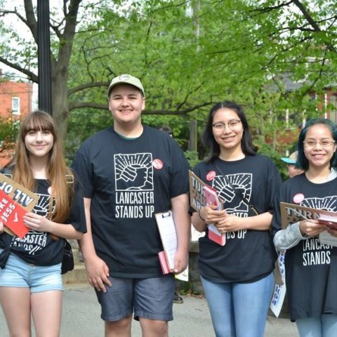
LSU photo
![]()
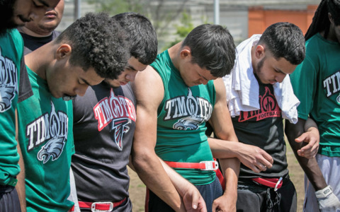
Lancaster Stand Up (LSU) is a grassroots advocacy organization committed to the common good. They stand with the most vulnerable in our society and strive to overcome the forces of racism, sexism, prejudice, and hate. They do this through working groups they have established on different issues and engaging the community in the political process. They are located in Lancaster, PA.
They recognized that they needed to rebrand because they were attracting more attention with their efforts. A consistent visual look would assist them in maintaining a credible presence in the advocacy and political arenas. Basic research on advocacy and political logos was conducted and used to develop their present look.
The former Lancaster Stands Up logo (above left) was a simple text composition combined with the shape of Lancaster County. Although their offices are located in Lancaster City, they wanted their logo to symbolize working together since Lancaster County’s history has a strong work ethic fostered by agriculture and construction. But they also recognized that they needed to reach beyond Lancaster C0unty to have a satisfactory impact.
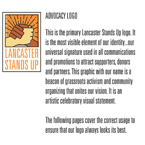
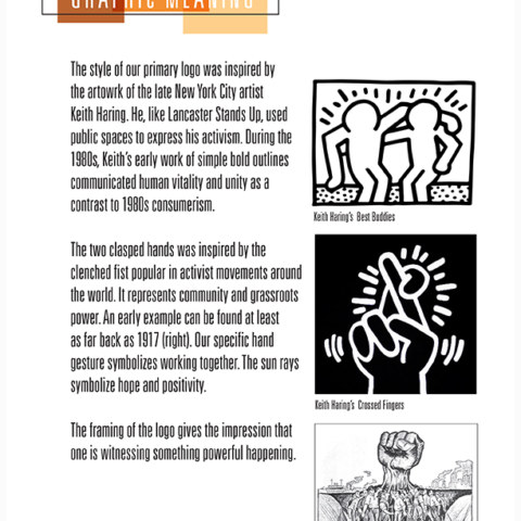
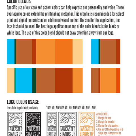
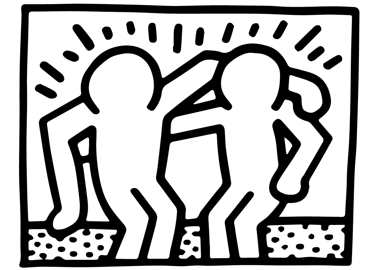 The new primary logo (above right) was inspired by the late New York City artist Keith Haring. He, like LSU, used public spaces to express his activism. During the 1980s, Keith’s early work of simple bold outlines communicated human vitality and unity. The two clasped hands in the LSU logo was inspired by the popular clenched fist popular in activist movements around the world. The sun rays symbolize hope and positivity. The color placement and textures in the logo are designed to mimic printmaking.
Deliverables
Logo Research
Logo Design
Stationery
Digital Graphics
Branding Guidelines
Marketing & Donor Materials