The Subversive Nature of Graphic Design

Any student of history knows what we remember most about empires and cultures are their symbols and structures (physical, social, cultural and/or economic). For example, what comes to mind when you think of the Greeks? Art (symbols), architecture (structures) and democracy (structure). China? A dragon (symbol) and the ruling dynasties (structures) . How about the Maasai in Kenya? Bright multi-colored beads (symbol) and their warrior initiation rites (structure). Egypt? The pyramids (symbol), the Sphinx (symbol) and the Pharaohs (structures). Symbols are usually visible and can be images of people, places and things. Structures are visible and invisible. They are physical or inconspicuous systems and processes.
Both the Fine Arts and the discipline of modern Graphic Design in the U.S. draw its influence from European aesthetics (art criticism); a philosophy that subjectively explores the creation of art, the natural world, how one sees and interprets it. Although Graphic Design in Western Europe grew out of the Arts and Crafts movement in the late 19th century, American Graphic Design grew out of the newly formed advertising industry in the early 20th century. Later, it was influenced by the Swiss style and was later placed under a broader term: Visual Communication. If one views Graphic Design as a form of visual communication, it can be argued that early cave paintings are a form of art AND visual communication. Since American Graphic Design got off the ground in the 1920s, other philosophies and ways of thinking have been marshaled by well known designers in service of it: Semiotics (the late Massimo Vignelli) Gestalt Psychology (Laszlo Moholy-Nagy), Postmodernism (April Greiman), Anthropology (Kenneth Hiebert), Deconstructionism (Katherine McCoy), Psychology (Paul Rand) and many others.
Both fine artists and graphic designers utilize symbols and structures in their work. The late painter and graffiti artist Jean-Michel Basquiat used haunting tormented figures as anti-establishment symbols (below). He extended this further into the structure of his unfinished scribbled visual collage look. The late American graphic designer Herb Lubalin (below) was known for his minimalist typographic experiments (symbols) using magazine templates (structure). But the interesting thing is both of these icons are perceived differently in society. Basquiat is viewed as a rock star in American culture. Only designers and type lovers know who Lubalin is. The Fine Arts is perceived of as having a higher value because important academic, cultural and financial institutions validate its importance based on their tastes (subjectivism). It is generally viewed in restricted spaces and well preserved. On the other hand, Graphic Design has perceived lower value because important academic, cultural and financial institutions validate its importance based on outcome (objectivism). It is generally viewed in public spaces and on disposable and fast moving technology (internet, etc).

Because of the perceived higher value of fine art, it is asked to do and be a lot of things in our culture such as a mirror (self-reflection) or a window (observation). It is sometimes on public display and integrated into pop culture. Although one should not mistake this for deep appreciation, nevertheless, the perception of fine art is generally neutral. Although Graphic Design also says a great deal about our culture, we have learned to ignore it. It is rare for Graphic Design to be recognized beyond simple beautification. Even the Academy Awards, the gold standard for awards shows, does not have any category recognizing the contribution of graphic designers. The closest category is visual effects. Considering how title design and the movie poster is important in promoting the film, you would think there would be some acknowledgement.
So, in spite of all of this, what makes Graphic Design so subversive? Here are 3 ways:
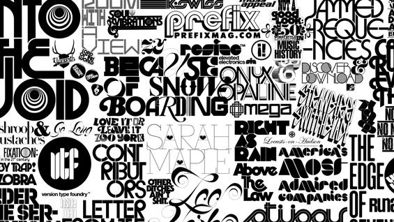
- Symbols include Language: Although a person may not have advanced knowledge about typography and white space, humans have a foundational understanding of communication. Coherence and clarity are important which is something we learn in kindergarten while writing letters. (Unfortunately, handwriting is becoming a dying art form.) Fine art can also be reduced to simple graphics like a smiling face. But once one starts thinking too much about how people perceive it (semiotics), it becomes less about self expression (fine art). A skilled designer learns how to communicate with language on multiple levels. Someone in Senator Hillary Clinton’s 2016 presidential campaign understood this which is why graphic designerJennifer Kinon, co-founder of Original Champions of Design, was hired as their Design Director. Although Senator Clinton lost, the graphic design quality and output from Kinon’s team of 16 designers is impressive.
- Visual Hierarchy is a Real Thing: Visual Hierarchy is when elements in a format are arranged in importance to capture your attention. This can be based on size, color, position, relationship and/or texture. All design disciplines and fields connected to visual communication use it. For example, when one looks at a road map, there will be a visual difference between a major highway and a road. Usually, there is a code that tells us what the visual differences mean. However, designers may communicate something in their work that needs to be discovered without a code. I owe my understanding to concealing and revealing visual ideas to two University of the Arts graphic design professors (retired): Kenneth Hiebert and Hans Allemann. While a student, both emphasized that new questions can emerge from the viewer through ‘playing with the elements’ in a restricted format.
- Systems and Structures Establish Order: While studying to get my graduate degree in Urban Studies, we learned that a growing city must create complex interconnected networks because innately, humans desire order. So, municipalities try their best to minimize threats (natural and man made) and create space for human habitation. (Unfortunately, ‘systems and structures’ can also be created to unfairly restrict people such as systemic racial discrimination.) Either way, what makes these processes work so well and hard to identify is their end goal: efficiency and invisibility. Graphic Designers involved in brand identity systems use these same methods. A successful brand identity, when implemented well, will fade to the background. When designers create these systems, they have to think about how to help people trust the systems they build or reshape. When done right, the recipients often will quietly internalize and defend it. How is that for influence?
Not all designers are interested in this interdisciplinary approach to Graphic Design. Some simply want to make things beautiful. That’s fine but Artificial Intelligence (AI) is learning to do the same thing. The same argument can be used about AI creating symbols, visual hierarchy and systems/structures. But there is one crucial difference: it is the human centered element combined with systems thinking that gives a designer an edge. It is the process of creative problemsolving that doesn’t follow all of the rules; it is noticing that ‘thing’ that everyone else ignores; it is being so aware of human nature in a way that no algorithm can replicate.
Can a fine artist do these things? Yes. For example, Eugene Grasset was an artist who designed furniture, tapestries, jewelry, etc. However, he became well known for his French posters and eventually taught graphic design. Some of his work overlapped with the burgeoning consumer culture of his time.
The subversive nature of Graphic Design is its ubiquity. Design and userface researcher Jared Spool said that good design, when it’s done well, becomes invisible. It’s only when it’s done poorly that we notice it. This means the designer must be that much more intentional about what needs to be communicated. This doesn’t mean that designers cannot create bold designs. But even when this is done, the designer is directing the viewer toward very specific emotions and responses, not to the fact that they may have used the Bodoni Poster font.
I take this subversiveness seriously because I am very aware of how easily it can devolve into propaganda. When Michael Brown was killed in Ferguson, MO in 2015, there was a flurry of fake news and photoshopped images painting him as a thug that deserved to die. This enduring archetype of Black men as violent is interwoven into American culture. My response was to create a shirt design celebrating the resilience of men of color. I gave them as gifts to my son and my brother-in-laws.
Graphic designers who move in an interdisciplinary direction have an awesome responsibility. But designers aren’t the only ones aware of this superpower. History is littered with leaders who used Visual Communication as a form of oppressive social and cultural control: Stalin, Hitler, Mussolini, etc. There is an ethical side to this issue that seems to only be explored when discussing rogue nations. But the U.S. has a long visual history of enduring racial, ethnic and cultural stereotypes that were supported by law. As American politics, businesses and cause related organizations continue to get better at harnessing visual communication, three ethical questions remain: Is it good visual communication? Is it propaganda? Is it both?
All I have to say is to much is given, much is required.
This is an excellent and well-crafted article! Incredibly articulate, yet also concise. I appreciate the examples, the historical references, the personal sample, and also the relationship of human systems thinking and visual communication with design.