
If you haven’t figure it out yet, designing highly publicized logos is becoming like the Roman gladiator games. With the quick response and snarkiness of social media (the hordes), your logo can be mauled to death by wild lions before it gains its footing.
Several high profile companies ran afoul of consumers (and a few designers) who used their new or rebranded logos as punching bags. In 2010, brand identity expert David Brier called out Gap in an article for inviting their facebook audience to crowdsource their new logo…with no criteria. He called it a “total Gap in understanding what branding is all about.” I am sure the pun was intended. After severe criticism, Gap went back to its original logo.

In 2014, airbnb took it on the chin when buzz spread saying their logo looks like female genitalia. Brett Domino took it even further and made a song posted on Youtube about it. To make matters even worse, some accused them of copyright infringement because Automation Anywhere had a nearly identical logo. (Not anymore. Visit their website. I don’t know how that was settled but I am inclined to say that airbnb has major gravitas.) There are plenty of other logos that have survived an ambush like airbnb while others have been run through with a sword.

Now, let’s turn to Hillary Clinton’s logo.
Her logo (above) is presently getting trashed on the internet. This does not surprise me. But truth be told, her logo stands out because it does not follow the very narrow campaign logos formula.
- Most are logotypes (combo of image and text)
- Patriotic elements (stars, wavy stripes, red, white and blue)
- Something wavy (text and/or flag)
- Americana (eagle, sun, flag, the U.S. capitol, country shape, etc)
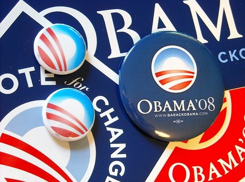
Most campaign branding is an exercise in gaudy graphic design: clip art looking graphics, a strict adherence to a certain value of red, white and blue, bad composition and a lack of branding knowledge. (State and local campaigns are even worse.) Its like the circus came to town. However, the Obama presidential campaign changed that by placing branding front and center with an eloquent logo, color variations, taglines and additional graphics (print and digital). But it still recieved its share of criticism.
What makes a great logo?
According to an Inc.com slideshow, there are five parameters that make a logo great:
- Simplicity (Functional and easily understood)
- Uniqueness (stands out)
- Adaptability (across marketing channels)
- Timelessness (rides above trivial trends)
- Context (Appropriateness)
Consumers may cry about a popular candidate’s logo but graphic designers should proceed with caution. Why? Because, if you have had design education or are well read on design principles, you should know that the parameters for designing a logo are usually narrow. Now, your creative process can be broader but ultimately the logo will still be subjected to the above parameters, industry standards and the client’s needs. This is one reason why many industries have companies with common elements in their logos, i.e. universities, banks, schools, fast food restaurants, etc. Since companies want to maximize their profit, a client would be wise to limit the scope of a logo. For nonprofits, it may not be about profits but understanding your audience becomes even more important.
You will see an occasional exception when a logo breaks the rules (Paul Rand’s IBM logo) and spark new trends. We all dream of that client where the sky is the limit but the goal for most of us is to engage our creativity within structure, not be trendsetters.
But the five parameters above still do not guarantee a great logo. The Inc.com slideshow asked for the opinion of designers who typically have design education and experience. In an age where everyone claims to be a designer and branding tools are affordable, the cost of commissioning a logo has dropped and horrible logos have increased. Logo stock and crowdsourcing websites are attempting to fill this demand.
What is Hillary’s logo attempting to do?
Here are three questions I see in cyberspace regarding Mrs. Clinton’s logo:
- Does it use white space in a dynamic way?
- Is the color value of the red and blue too close?
- Should the arrow be pointing to the left (Democratic)? Does the red read ‘Republican’?
According to Alina Wheeler’s Designing Brand Identity book, her logo would fall under ‘letterform mark.’ The letterform acts as a mnemonic device. When combined with another symbol, it calls on viewers to associate the identity of Hillary Clinton (letter H) with moving forward (the arrow). But remember, Obama did it first in his last presidential campaign with the letter O. I suspect Obama’s team did this to de-emphasize his Muslim sounding name. Hillary may be taking a page from his book downplaying her name. Is this to disassociate her from the perception of being a Washington insider and/or a dynasty? (Jeb Bush will have the same challenge.)
Because consumers have outsized influence via social media, their loud voices are influencing branding decisions. These social media bullhorns mistakenly convince many that their limited knowledge about logo design is suitable and should be taken seriously. On the internet, perception is everything. So, I feel for the big name designers and celebrity clients who receive an extra dose of scrutiny when a new/rebranded logo is introduced. It seems like separating one’s personal feelings about someone from their professional opinion about their logo/branding is becoming a bygone art. But skilled designers SHOULD be able to make this separation.
Some are saying Hillary’s logo is not remarkable partly because it is so simple: it utilizes hard angles, a basic letterform and an arrow that looks like clip art. Here are a list of well known brands with logos that, in my POV, aren’t very remarkable: Apple, Target, Visa, McDonald’s, Volkswagon, Black and Decker and many more. What’s make the logo and company remarkable: consistent branding!
If anything, I do think Hillary’s logo could be stronger in the uniqueness department and with the colors. (The colors are good choices but the values are so close that they provide very little contrast.) For now, the branding will have to help overcome these issues. airbnb did it so why can’t Hillary?
Some will say what matters most are Mrs. Clinton’s ideas. Agreed but don’t think for a minute that brands don’t influence your life. If you believe that, then the brand is doing its job.:)
I leave you with this quote:
“Designers tend to overvalue differentiation and originality. We are taught this in design school.”
Guess what? Award winning designer Michael Bierut of Pentagram said this in an article two years ago. And he is right. Oh, by the way, he designed Mrs. Clinton’s logo.
What is your take on this?
Some of those designs are REALLY good. There’s a TON of talent out there. No research was done apparently. I like Hillary Clinton side pose. LOVE this article.
Amazing logos, these of all are beautiful inspirations