How Graffiti Influenced My Understanding of Typography: Part 1

This Style of Typographic Folk Art Should Get More Respect
Although we had never heard of this designer, all of us were super excited about the coming workshop. We just knew he was Swiss and that was good enough for us. In the late 1980s, the majority of the University of the Arts graphic design professors were graduates of the Basel School of Design in Switzerland. This school was a champion of The International Style, a design philosophy that originated in Switzerland in the mid 20th century. It is the basis of modern corporate graphic design in the U.S. and western Europe. High value is placed on simplicity, legibility and functionality within a rigid grid compositional structure. We owe Futura, Helvetica and Univers to Swiss typeface designers influenced by this style.
Wolfgang Weingart, an instructor at Basel, was visiting the juniors for a week to show us how to do typography. He is considered the father of New Wave Typogaphy which emerged in the 1970s as a postmodern reaction promoting typography as playful, expressive and experimental. The results are usually a more kinetic and intuitive use of type (see examples below) which, in some cases, pushed the boundaries of legibility and comprehension. Countless well-known designers were influenced by him such as April Greiman, Dan Friedman and Neville Brody. Although what I remember most about Mr. Weingart was his disheveled conservative look, I learned a great deal from him. (I admit that I did not understand the gravity of his presence at that time. In my ignorance, I had a hard time listening to someone whose name is pronounced Volfgong but I made the best of it. LOL)
But this was not where my love for type was first inspired. It started in kindergarten where I practiced handwriting everyday. But typography leapt off the page when I stared at 1970s album covers and the colorful vibrant graffiti art on walls in Philadelphia.
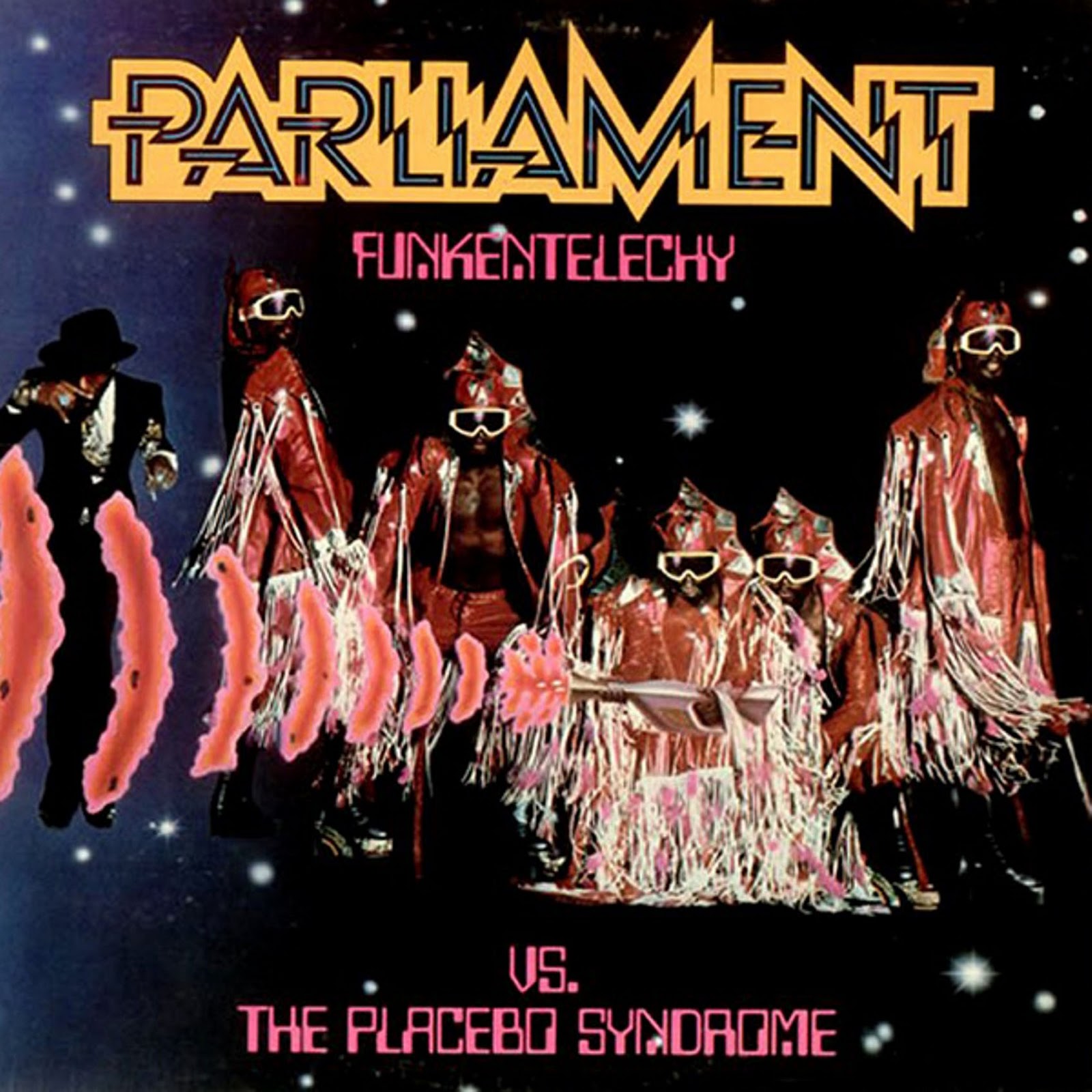
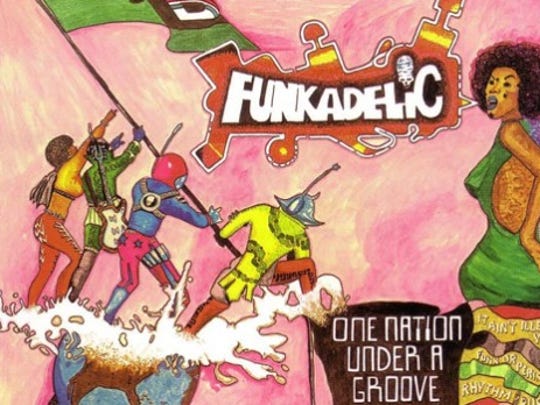
The artwork on album covers were exceptional but, for some reason, I was more drawn to the typography. Somehow I could see and feel the electricity of the word ‘Parliament’ on the Funkadelic The Placebo Syndrome album cover (1977). This peaked my imagination more than their weird outfits. I also noticed the same exact typographic style for their band name on some of their other albums realizing it functioned like a logo. The hand drawn word ‘Funkadelic’ on the other album cover felt like a form of graffiti with its letters leaning into each other like family. I was eight years old when typography started to make sense to me. My response was to practice redrawing the stylistic titles from these album covers.
Redaction: In honor of Black History Month in 2022, I did further research and discovered that many of P-Funk’s album covers were designed by two Black men, Overton Lloyd and Pedro Bell. Both made good use of typography in their work and were good friends with P-Funk lead singer George Clinton.
Born in 1954 in Detroit, MI, Lloyd is considered a caricaturist, comic artist, animator and illustrator. He created the P-Funk comic book that went inside the sleeve of one of their albums, illustrated some of their album covers and designed some of their outfits. In addition, Lloyd was recognized by Billboard for Best Use of Computer Graphics for George Clinton’s 1982 Atomic Dog video.
Pedro Bell (June 11, 1950 – August 27, 2019) was an artist and illustrator known for his album cover designs and artwork for numerous Funkadelic and George Clinton solo albums. Some consider his work to be a precursor to the modern graphic novel and the Afro-punk movement.
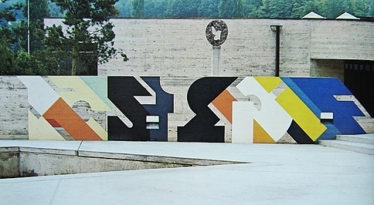
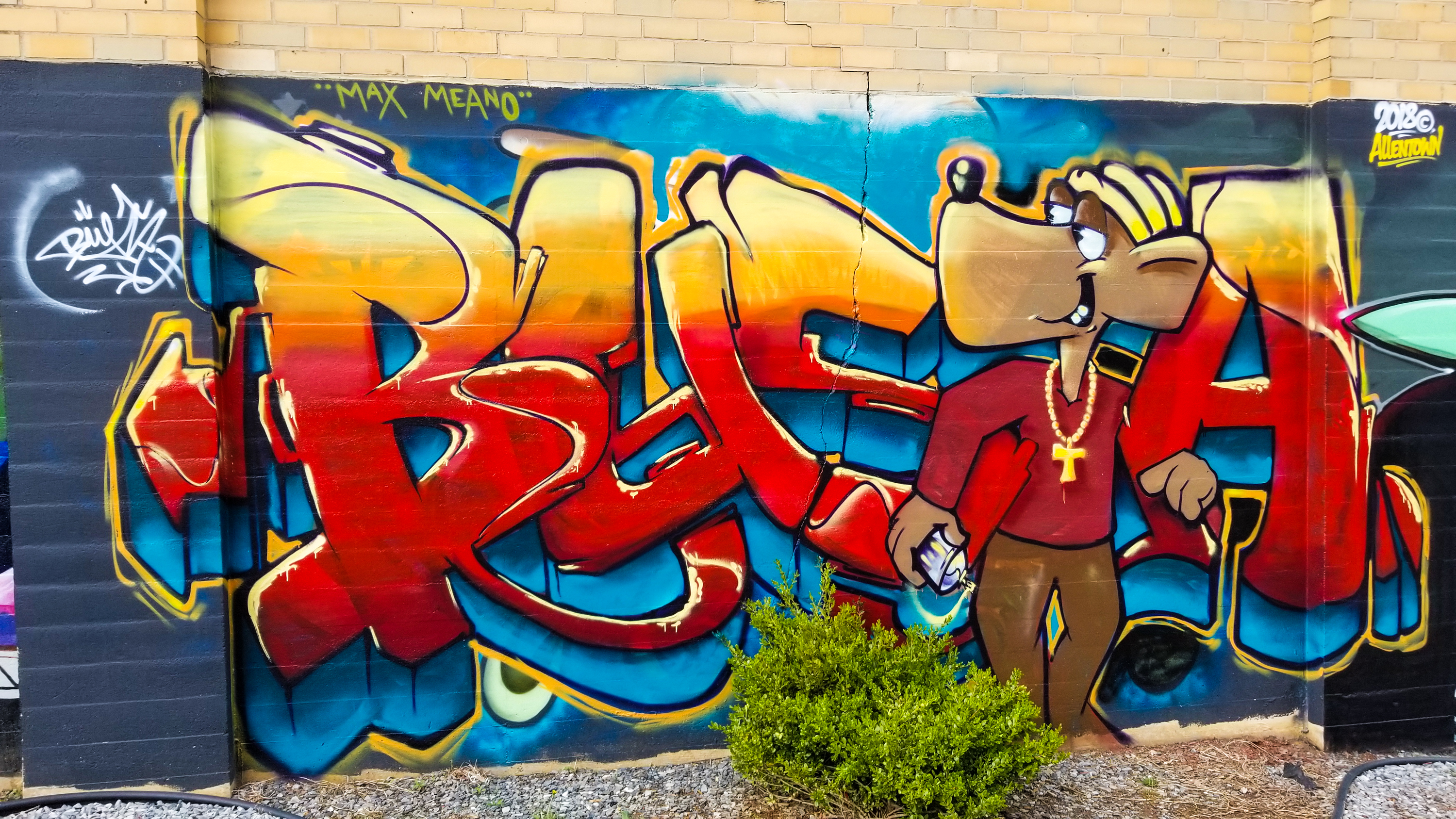
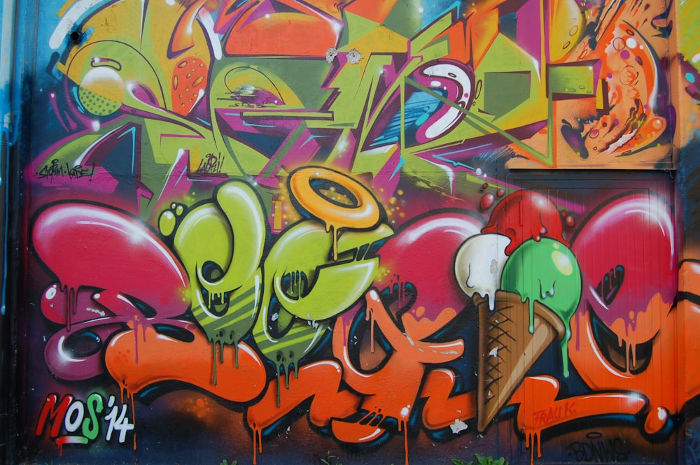
Around this same time, graffiti expanded from writing (tagging) to art (burners). Did you know that the earliest American graffiti writing was birthed in Philadelphia in the 1960s and eventually showed up in New York City? The newly emerging Hip-Hop culture in the 1980s was the voice of my generation with the four creative pillars holding it together: Emceeing (rapping), Djing, Breakdancing and Graffiti. (Some argue the 5th pillar is fashion). In my middle school years, I slowly transitioned from drawing out of comic books to illustrating my own graffiti in notebooks. I focusing on developing my wildstyle technique (see image at top of the article) adding urban cartoon-like characters and additional graphics (arrows, bubbles, wall cracks, etc.) for emphasis and creativity. Although I did not do it, real graf artists placed their full multi-colored pieces in strategic locations. In Philly, one could find them on the side of the buildings where commuters could see them while commuting on the Elevated train. Once I entered high school in the early 1980s, my graffiti style leapt from my notebooks to hats and tees. When I give an airbrush set as a gift, my art went to another level.
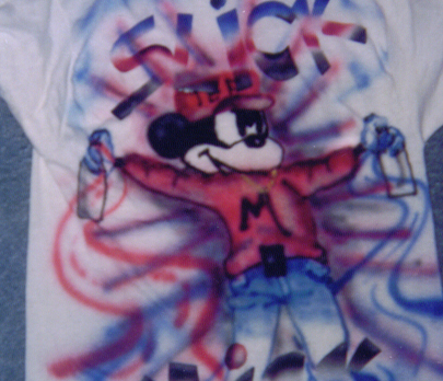
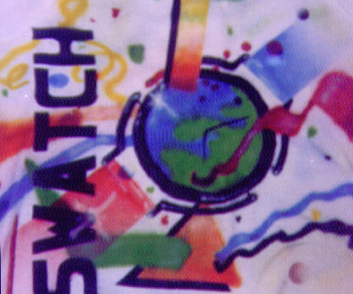

Although I created tees and hats for many people, above are the only two documented airbrushed pieces I have. In the mid 1980s, popular cartoon characters were showing up in graf pieces in subversive ways so I created the Slick Mick tee. As post modern design was becoming the dominant philosophy and visual expression in pop culture, breaking aesthetic rules, eclectic typography and bold flat shapes became the norm. Swatch Watch benefitted from this trend is this aggressively consumer decade by creating disposable timepieces (above) with unique colorful post modern watch face designs extremely popular among teens and young adults. Although I never owned one, I associated myself with the craze by airbrushing my own Swatch sweatshirt (above). Guess where this watchmaker originated? Switzerland.
But, back then, graffiti was not viewed as art. It was associated with all things negative: gang activity, urban decay, people of color and hip hop culture. It was labeled vandalism and linked to urban crime (Broken Window Theory). Major U.S. cities made it their business to paint over as many graffiti pieces as possible. Although there is truth to some of these claims, no one ever thought to validate the sheer illustrative natural talent coming out of these artists. Many of the artists were African American, Puerto Rican and White kids from poor and working class families who honed their skills breathing the essence of their neighborhoods. This is why I call it folk art. Graffiti art was subversive in that it did not ask permission and it screamed to a city that routinely ignored its poor and working class residents, especially if they were black and brown.
Redaction: Before I even set foot in the University of the Arts, I now realize that I brought an eclectic understanding of post modern visual culture and typography to the school that was creative, living and fluid…and not classically European. Although I was not knowledgeable and confident enough to allow what I knew to impact my school projects, it still influenced my thinking in three specific ways:
The Importance of Visual Culture
Visual theorist Nicholas Mirzoeff’s defines visual culture as a tactic for studying the functions of a world addressed through pictures, images, and visualizations, rather than through texts and words. It is a fairly new field and overlaps with film studies, psychoanalytic theory, anthropology, aesthetics, social science, semiotics and digital arts. Although western culture has held that the spoken word is the highest form of intellectual expression for last three centuries, we are rapidly moving towards an image culture that prizes the pictorial over the textual. In this age of innovation when images can be reproduced rapidly, visual culture has emerged as a way to discuss how visual experiences have become central to everyday life. Observing graffiti art heightened my ability to understand and interpret my surroundings through the work and where it was placed. Also learning to read a piece, study style choices and the colors provided visual inspiration and helped me build a sociological persona of the art and artist. (Of course, I assumed they looked like me. LOL) Honestly, I did not do this for academic exploration. I did this because I wanted to become a better artist. Graf artists were my first artistic role models
Through an anthropological and sociological lens, I started asking questions. What was their motivation? Why wasn’t there public spaces dedicated to this kind of art? Why the cryptic typography? I became more open to exploring the meaning and purpose of graffiti art, in general. Some pieces I viewed were very elaborate with interlocking letters and patterns like a poem with hidden meanings and metaphors. Others were very simple as if it was supposed to impact my subconscious like a marketing message. A sophomore sociology class in college was an aha moment for me. At the time, my confidence in my graphic design abilities was shaky at best so I considered transferring to another university to study sociology. I realized I had been studying society, culture, patterns and social relationships in some form all my life. It came so natural to me. However, I am grateful I did not change my major. I even tried to document the graffiti in Philadelphia as an assignment for one of my college electives. But I abandoned it because local law enforcement became so good at cracking down on graffiti artists. It became harder to find fresh pieces. Ironically years later, I would eventually get a MA in Urban Studies which is related to sociology.
The Power of Typography as Text and Image
Type expert John Berry says that “graffiti, calligraphy and sign-painting are all processes done by hand. Typography is not; it’s the arrangement of pre-existing letters into words and sentences. Actually, early 20th century type designers did create type by hand using punchcutting and engraving. But I do agree that the initial purpose was for printing and therefore, reading. But as innovations in printing improved, creating typefaces became less artisan and more mechanical (lithography and photographic processes). From there, it eventually became digital. The post modern movement allowed artists to make type much more personal. However, there are other artisans and artists throughout history who blurred the lines between image and text. This can be seen in Egyptian hieroglyphics, African writing systems and motifs, illustrated manuscripts from the European Middle ages, etc. There are also modern examples that challenge our comprehension through their use of text and image (see below). But keep in mind that graffiti art was doing the exact same thing around the same time.
Armin Hofmann, Language, Basel School of Design, 1970.
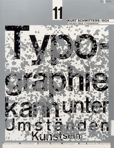
Typografische Monatsblätter book by Wolfgang Weingart. 1973

William Longhauser, The Language of Michael Graves, 1983.
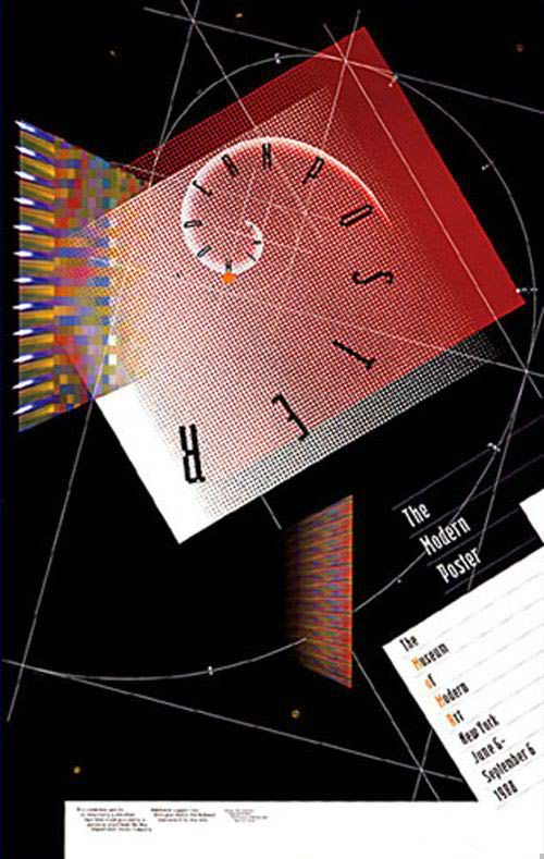
April Greiman, The Modern Poster, 1988.
Although the heart of typography is continuous text, the work above and graffiti art (below) take a post modern approach breaking legibility rules over and over. As a result, interesting and bold work has emerged. However, graffiti art has never received consistent respect from the art and design world like other art movements including the work above. Below is a piece of artwork that I created called Art Has Consequences. Look closely at it before you read any more. What letters do you see? It hides the word ‘art’ in the work to symbolize that art is a creative act that impacts the paper and the viewer. Ultimately what we need to remember is that written alphabets are basically unique graphic marks created to form language. So, I view typography as simplistic visual images that can be literal, metaphorical and abstract.
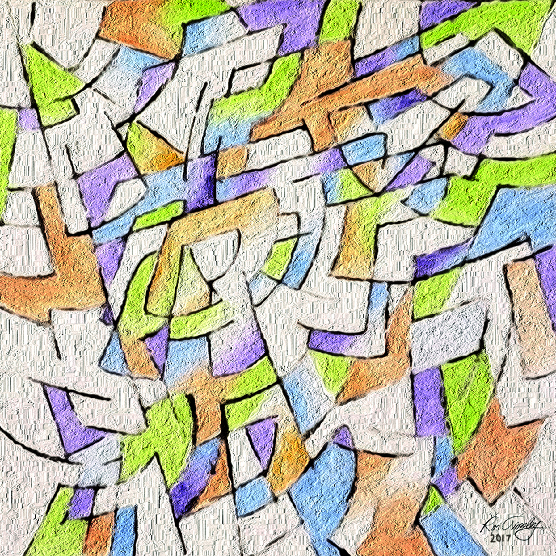
Ron Tinsley. Art Has Consequences. 2017. Click to purchase.
Click here to read Part 2