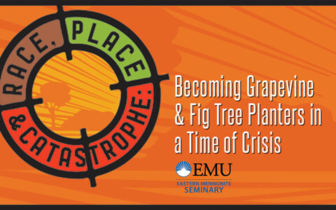
Case Study: Rebranding for a Convention
Case Study: Rebranding for a Convention
Strategy: Rebrand a convention for a diverse audience with a focus on youth and young adults.
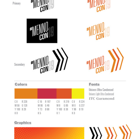
logopage-01
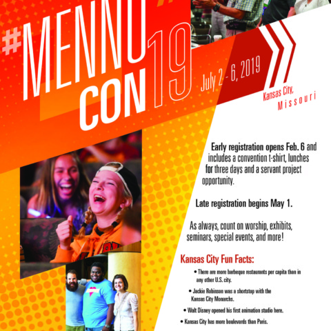
Save the Date Postcard
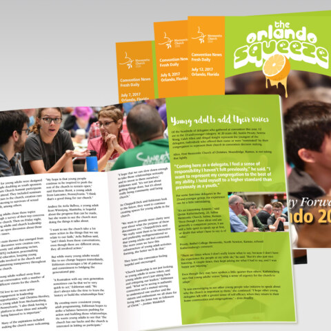
Newsletter Template
Print Ad
Online Ad
Online ad
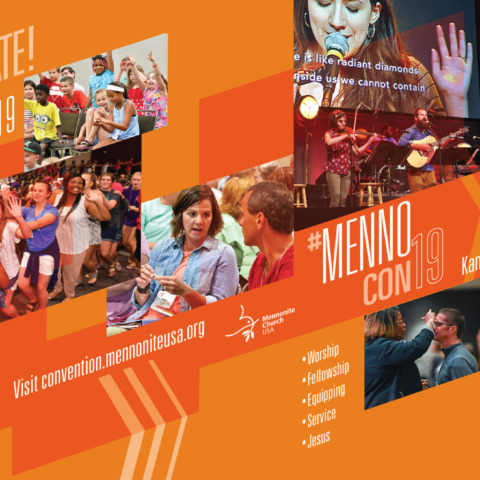
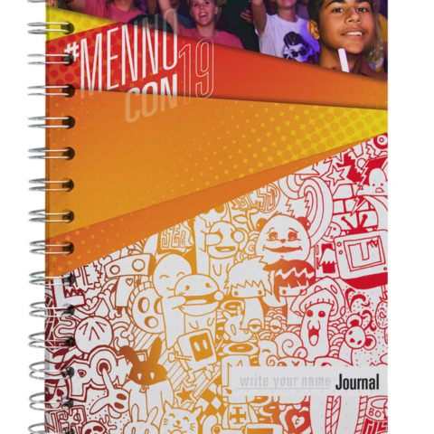
Convention journal
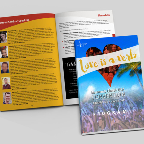
2019 MC USA program book
digital graphics
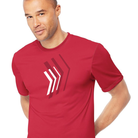
MennoCon19 tee
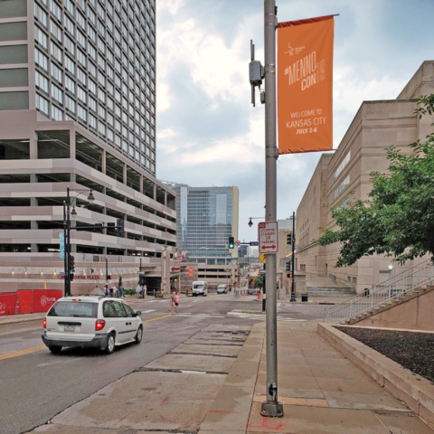
Convention banner
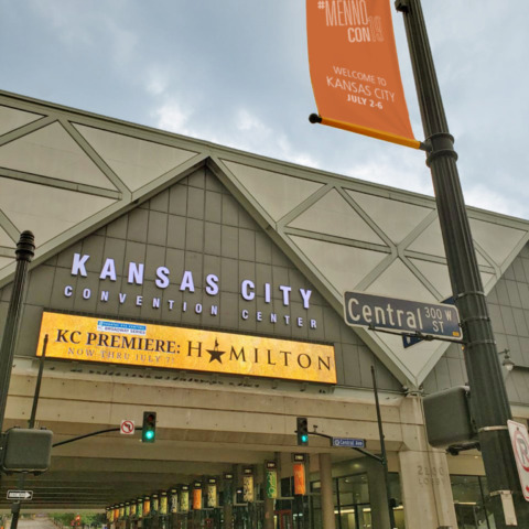
Convention banner2
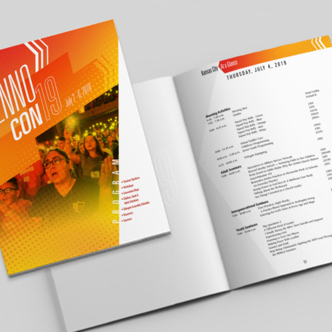
Program Book
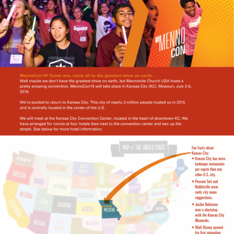
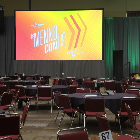
Mennonite Church USA is an Anabaptist Christian denomination in the United States with 625 congregations and 65K+ members. Every other year, they hold a week-long church-wide convention that includes featured speakers, worship sessions, seminars, youth events and a service component. The convention is July 2-6, 2019.
Their primary audience are:
- Children and Youth
- Young Adults
- Adults
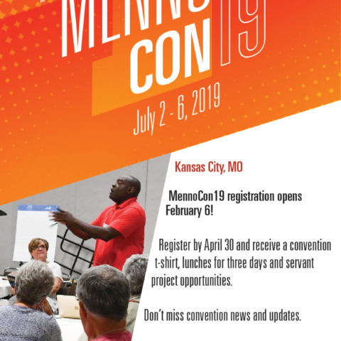
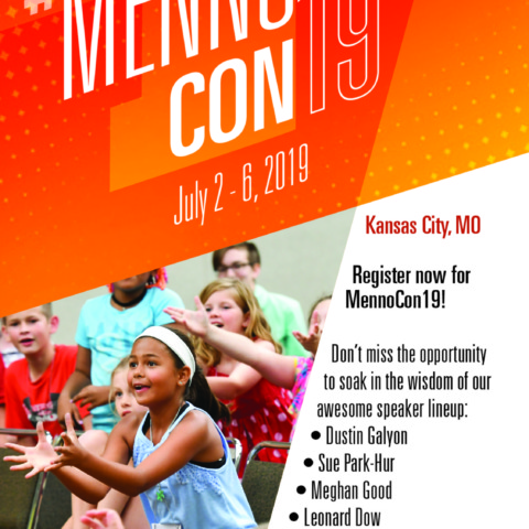
Although every convention is branded with a new theme and look, this time they decided to simplify the branding approach. The first goal was to create a name that could be used at future conventions: #MennoCon19. (In two years, it will be #MennoCon20.) This meant developing a new look that has its own fonts, color palette and multiple graphic applications that is not governed by their organization branding guidelines standards. They also decided that they wanted youth and young adult to be the primary focus although advertising will be developed for older adults as well. Vibrant colors, textures, arrows and diagonal planes were chosen to be visually engaging and to convey movement and energy.
Here around other past projects for MCUSA.
MC USA newsheet
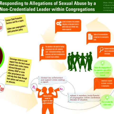
Infographic
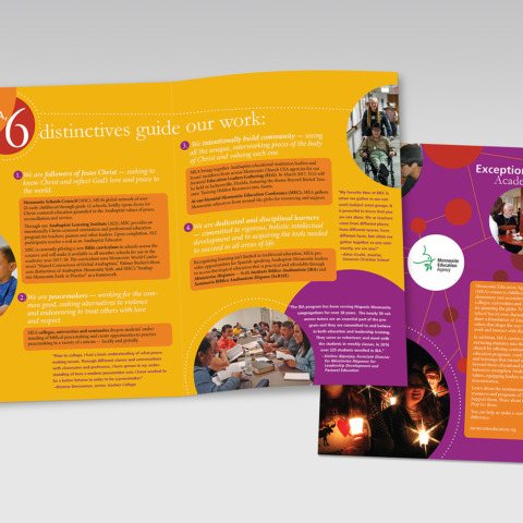
Conference Program Book
Magazine Insert
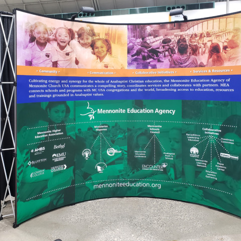
MEA display
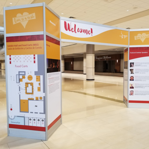
Convention Welcome Unit
Deliverables
Logo Design
Color Palette
Postcard
Newsletter template
Print and online ads
Youth Journal
Convention tee
Display
Program Book (English and Spanish)
App graphics
KC Sauce (graphic with convention updates)
Outside convention banners