Case Study: Camp WeBuild
Case Study: Camp WeBuild
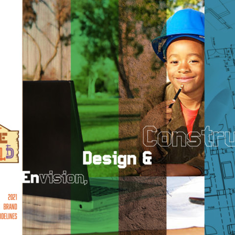
Strategy: Create a branding experience for a kids camp focused on design, architecture and construction targeting underrepresented groups.
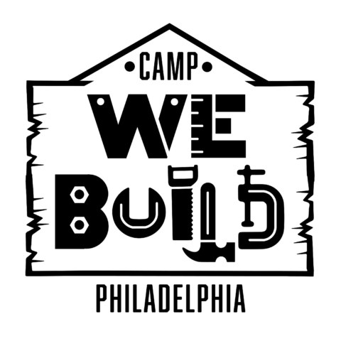
CWBlogoPHL_BW
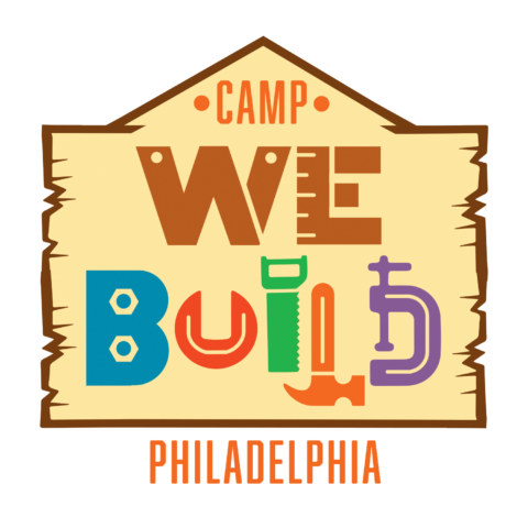
CWBlogoPHL_RGB
CWB Guidelines-1
CWB Guidelines-3
CWB Guidelines-4
CWB Guidelines-16
CWB Guidelines-15
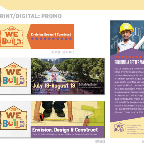
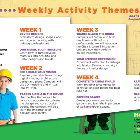
Brochure
Brochure
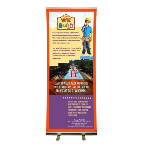
CWB display banner
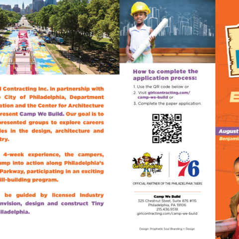
Girl Contracting, Inc. a local minority-owned, female-managed commercial and residential construction company contacted us to help brand an innovative kids summer camp in Philadelphia.
The purpose of Camp WeBuild is to help address the race/gender underrepresentation in the design, architecture and construction industry using a “hands-on” educational and skills-based approach. The goal is to empower youth of color, ages 10-14, to explore non-traditional careers and leadership roles in design, architecture and construction.
This 4-week skill-building experience on Benjamin Franklin Parkway will tap industry professionals to help approximately 50 campers build tiny homes to be transported to West Philadelphia to spark neighborhood improvements and address the affordable housing crisis.
There were two audiences:
- Parents/Teachers
- Donors/Supporters
Logo Process
There were three elements we were asked to represent when designing the logo: Philadelphia, Tools and Kids.
We understood but clarified that there are ways to suggest the above elements in a logo explicitly and implicitly. The logo would need to be usable in print, digital, wearables, accessories and multimedia. So, branding guidelines would need to be developed as well. Since the time was tight, we enlisted two local African American designers to submit logo ideas. We met together to showcase our concepts and narrow the field. Our collaboration sparked other ideas which led to these three final logo concepts.
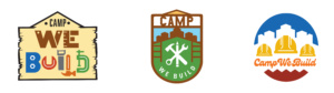
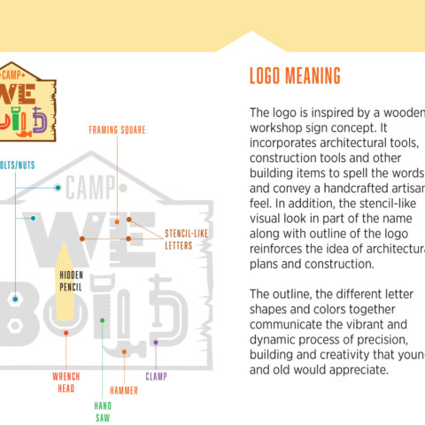
Concept #1: This idea is inspired by a wooden workshop sign concept. It incorporates architectural tools, construction tools and other building items to spell the words and convey a handcrafted artisan feel. In addition, the stencil-like visual look in part of the name along with outline of the logo reinforces the idea of architectural plans and construction. The outline, the different letter shapes and colors together communicate the vibrant and dynamic process of precision, building and creativity that young and old would appreciate. (The letters as tools would make for a good discussion with the campers.. BTW, can you find the hidden pencil?)
Concept #2: This idea is inspired by the Scouts and Girl Scout merit badges. The badges are very emblematic and simple. They represent hard work and achievement. This idea incorporates architectural tools and construction tools. The emphasis is on the overall design and symbolic meanings: the ladders represent upward mobility, the road represents goals and the city represents community (tiny homes).
Concept #3: This idea is inspired by construction trades icons: simple and easy to decipher. This logo incorporates the construction hard hat as a stand-in for people and tools. The hats symbolize team and community. The shapes at the bottom represent tiny homes.
We tried to walk a balance between appealing to parents/teachers using letterforms and colors and appealing to donors through high quality branding materials and written content..
![]()
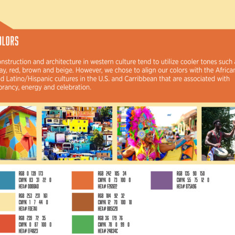
This was the final logo. Although urban commercial architecture in the U.S. tends to utilize cooler tones such as gray, red, brown and beige, we chose to tap into the folksy spirited colors of African, African American and Latino/Hispanic cultures in the U.S. and Caribbean that are associated with vibrancy, energy and celebration.
Deliverables
Logo
Branding Guidelines
Stationery
Rack Card
Promo Brochure
Powerpoint Template
Outside Banner
Retractable Banner
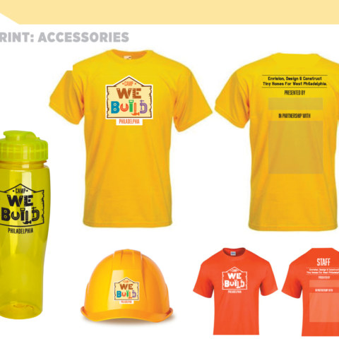
T-shirt
Logo Designers:
Ron Tinsley
Monna Morton
Christopher Coley