Case Study: The Evolution of a Logo
Case Study: The Evolution of a Logo
Strategy: Create a logo that bridges the gap from the streets to a better quality of life.
Screen Shot 2021-05-27 at 1.36.19 PM
PB Logos
PB Logos
PB Logos
PB Logos
PB Logos
PB Logos
Ertz
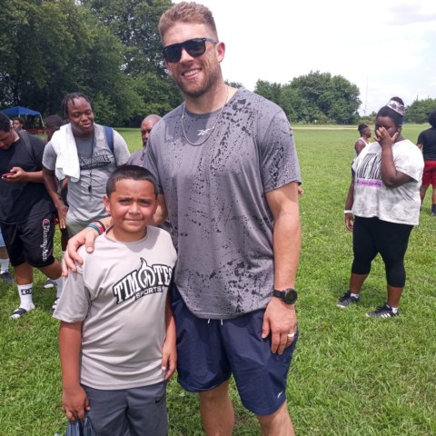
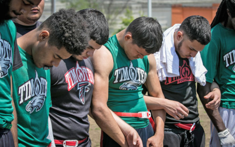
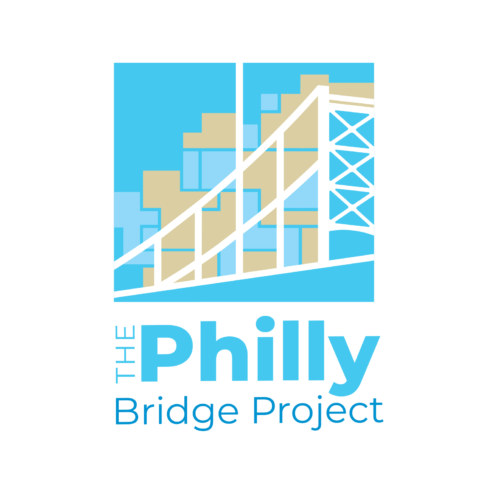
The Philly Bridge Project brings nonprofits in North Philly together to stand in the gap for youth. Gun violence is up in poor and working class neighborhoods and youth are caught in the crossfire and getting killed. The Ertz Foundation, started by Philadelphia Eagles football player Zac Ertz and his wife Julie Ertz, a member of the U.S. women’s national soccer team, are behind this initiative. These nonprofits seek to provide outlets for the young people to give them hope and to embrace life.
They initially requested these items in the logo: a bridge, buildings, people, streets and something about North Philly. They were encouraged to be open to possibilities that are a lot simpler than their request.
History
The initial industrialization that took hold in North Philadelphia at the beginning of the nineteenth century laid the foundation for rapid changes later. Nineteenth-century maps of Philadelphia document urban expansion replacing farms with homes, factories, warehouses, etc. This attracted workers to work at the factories. Steel companies, textile mills, tanneries and shipbuilders, other manufactories and cottage industries filled North Philly giving the city the nickname “The Workshop of the World.” This section of the city became the playground for the rich who were responsible for much of the industrial, civic and social developments in the city. As immigrants poured in, their culture added to the flavor of Philadelphia.
Around the turn of the 20th century, African Americans from the south began to migrate to Philadelphia and other northern cities, Some of North Philadelphia’s neighborhoods became important centers of black culture and black activism. Nevertheless, white flight led to increased segregation in the area during the 1950s and the 1960s followed by many businesses. Each factory closing increased stress on neighborhoods along with housing discrimination that increased poverty and racial tensions. In the 1980s and 1990s, North Philadelphia became synonymous with urban decay. Blocks of abandoned buildings and nearly deserted streets revealed the social and economic divestment. Neighborhoods nearest to Center City witnessed rapid gentrification as bars, restaurants, and galleries slowly replaced the decaying factory buildings or abandoned lots. Some North Philadelphians were frustrated with the waves of change that beset their neighborhoods fearing that their culture would be lost in the process. Others recognized that North Philadelphia’s history revolves more around transformation and embraced changed. It is this constant transformation that has made this section of the city into one of Philadelphia’s most fascinating areas. Based on this history, we initiated the steps below to develop the logo.
Step #1
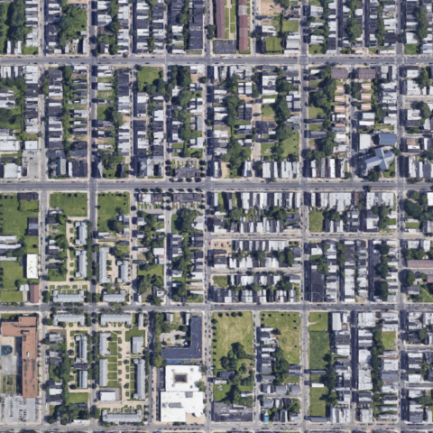
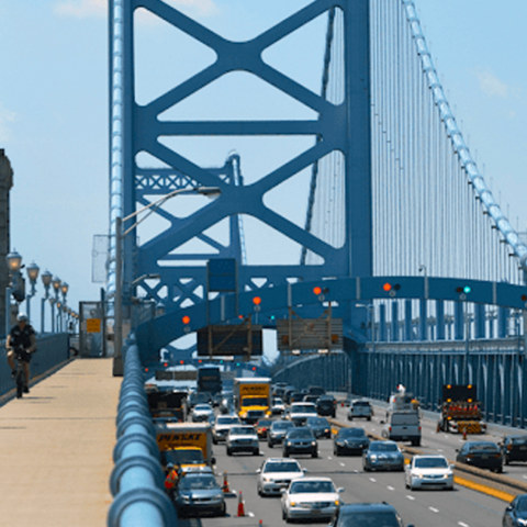
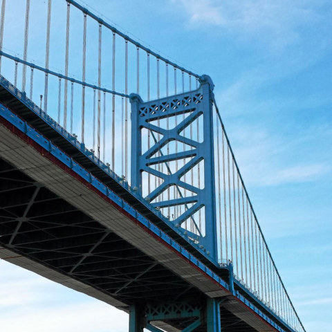
Research photos of North Philly neighborhoods (aerial views) and Philly bridges. The Ben Franklin Bridge was chosen since it is the most traveled and visually iconic compared to other Philly bridges. (Anyone who grew up in Philly knows the Ben Franklin Bridge when they see a picture of it.) See photos above.
Step #2
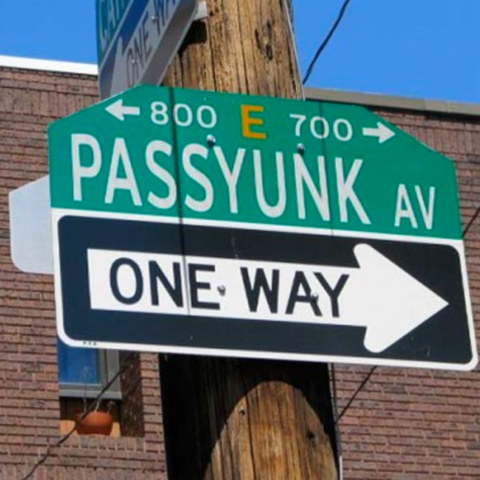
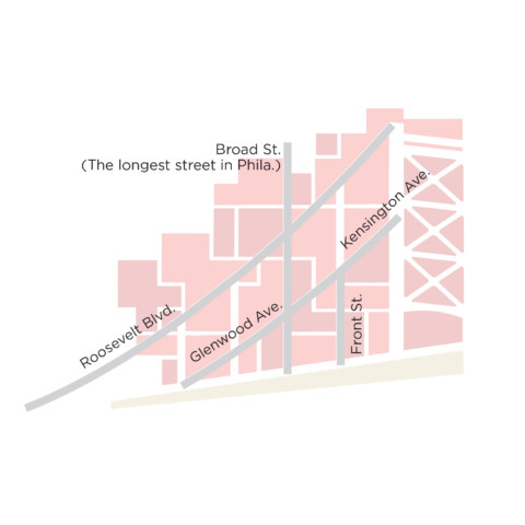
Philly is built on a grid system. Street signs have numbers below the street name that indicate what specific block it is. Look at the sign above. Those numbers tell you the address numbers that are on that block which tells you how far north, south, east or west you are in the city. This makes it easy to navigate the whole city. This led us to explore streets patterns and closely examine specific traffic arteries. (See photo above that has the street names on them.
Step #3
Explore specific North Philly neighborhoods that show a mixture of residential, civic, educational commercial and religious institutions.
Conclusion
The logo utilizes the Ben Franklin Bridge, visual aerial views of North Philly along with major traffic arteries in the city. The bridge is a metaphor for a pathway to a meaningful life for young people in a section of the city where crime and hopelessness is common. The color blue comes from the bridge while the beige and lighter blue represent concrete and various buildings in North Philly. Nicknamed The Concrete Jungle, it has very few green spaces in its interior most likely because of its past industrial history. The bridge suspension cables are traffic arteries functioning as hidden gems to be discovered when the logo is explained. Although the logo skirts the boundaries of complexity, it is an attempt to create a dynamic visual mark that symbolizes the best about this section of the city…where the owner of Prophetik Soul Branding+ Design grew up.
Deliverables
Logo
Brand Guidelines
Stationery
Print display banners
T-shirt